

Rebranding of SPAM, Project Ambitions


This project called ambition is just as you expect. following your ambition.
My ambition is to become an graphic designer so for this project i wanted to test my abilities to discover that things i have to learn and improve. So instead of creating a new project, i chose to rebrand a existing product to lessen my workload and focus on my ability.
Why i chose Spam is a good question. I found the concept of spam intriguing and the peoples opinion of it even more. So i wanted to challenge myself by making the product more appealing for the customers.
First i had to do research. About Branding and the brand itself.

The History of SPAM
Before delving into the rebranding efforts, let's take a moment to appreciate the history of SPAM. SPAM, short for "Spiced Ham," was created by Hormel Foods Corporation during the Great Depression as a convenient and affordable protein source. Its popularity skyrocketed during World War II when it became a staple for soldiers and civilians alike due to its long shelf life and versatility. Over the years, SPAM became a cultural icon in the United States and around the world.
The Challenge: Rebranding SPAM
While SPAM has a loyal following, it has also faced its share of misconceptions and stereotypes. To address these issues and give SPAM a fresh lease on life, the students embarked on their ambitious rebranding project. Their aim was to celebrate SPAM's rich history and transform its image for a new generation of consumers.
So i made a plan. I would make a recognising color pallet, a logo and some variations of the products packaging.

For the color palette i chose some new and some old elements. I retained the classic SPAM yellow and blue, symbolizing tradition, while adding various shades of pink for playfulness. Light and dark blue and green were included to emphasize sustainability, and brown evoked nostalgia and authenticity. This dynamic blend of colors strikes a balance between tradition and innovation, ensuring SPAM remains relevant and appealing to both long-time fans and new consumers.

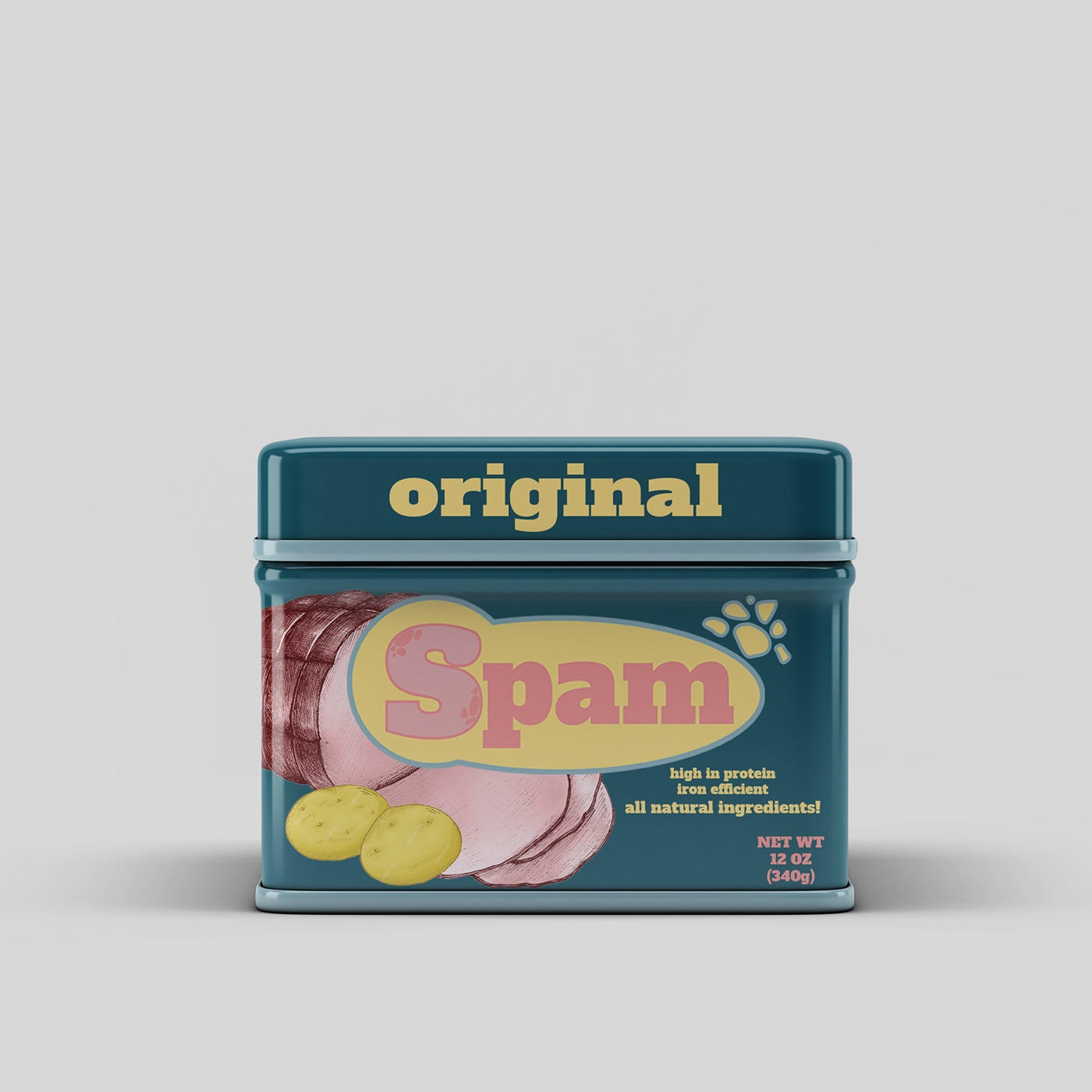
For the project rebranding SPAM, I created a straightforward logo. It features a light pink "S" outlined in dark pink, with spots to make it look like meat. At first, I tried a 3D design, but it didn't work well on smaller surfaces, so I opted for a simpler 2D version.
Around the "S," there's a yellow circle with a blue outline. This combination represents SPAM's history and my effort to maintain its quality. This new logo aims to blend tradition with a modern touch for SPAM.


I faced the challenge of redesigning the packaging to give it a fresh look without appearing cheap. My aim was to maintain a healthier essence in the branding. i first got this design but i didn't succeed in making it look not cheap.

So i tried again but this time instead of traditional graphics, I used rustic drawings of the ingredients within SPAM, like ham and spices. These illustrations conveyed a healthier, more natural essence. The choice of earthy colors and eco-friendly materials enhanced this rustic feel, reflecting SPAM's commitment to sustainability and responsible sourcing.
The use of rustic drawings not only added a touch of uniqueness to the packaging but also conveyed a sense of wholesomeness, making SPAM's image more health-conscious while staying true to its affordability. This innovative approach transformed SPAM's packaging, achieving the desired balance between freshness and accessibility.


What i learned from this project is that i still have a long way to go. from color palettes to logo's but my motivation to learn all this grew even bigger. I now understand how difficult it is to make product packaging and the use of different things like images, shapes and typography. I hope i get more opportunities like this to test my skills.
-Emi Hiraki. 25-1-2024


